
I’m all over the place… But still, it’s one place. Typography.

Spending months practising my handwriting, then leaving it to make type. Or design a book. Or write one.
Letters in their many forms.
Different things, same fascination.
__In Progress
I teach typography at the Willem de Kooning Academy. Doing research is part of my practice, and in the coming study year (2026–2027) I will start a project I have been wanting to pursue for a long time.
OUTLINE
I will research the relationship between language and typography, approaching language as a design tool that works closely with typography. This is still an underexplored area within typography, and most existing work remains largely theoretical.
My aim is to make this more practical through visual experiments. I investigate how language and typography influence each other, and when typography moves beyond being a visual translation to become part of language itself. Ultimately, this work aims to rethink typography education, and to frame it as something closer to ‘visible language’.
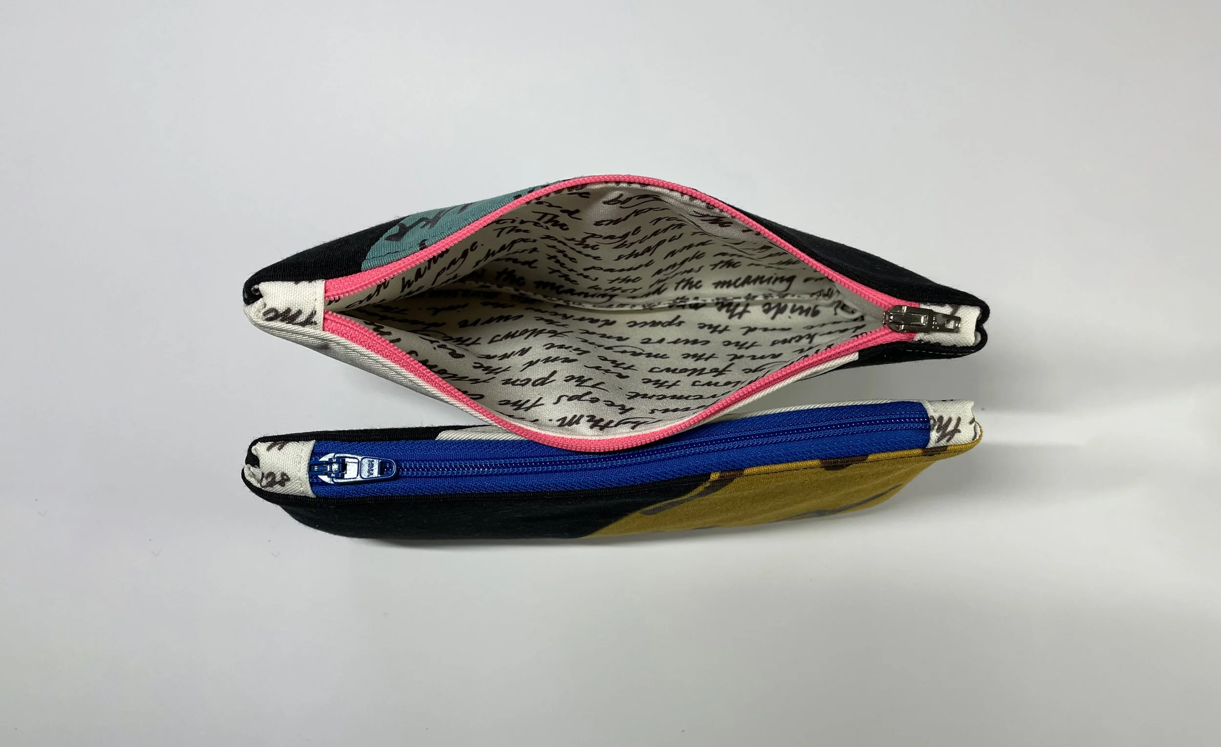
__Pouches
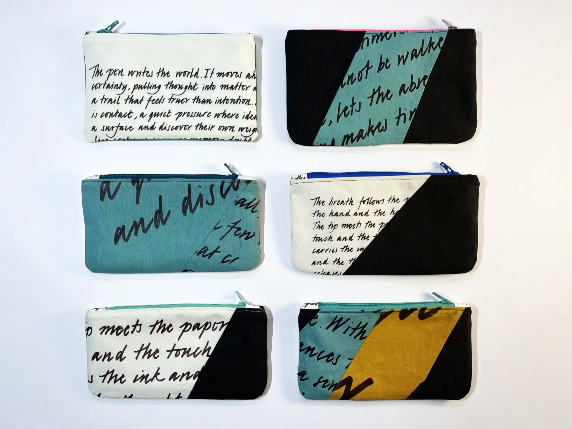
Related to the manual, I design these pouches featuring my own handwriting. Made by a true perfectionist. They’ll be available for sale on Instagram!
__Instagram
Small traces of how I think, updated on a very ‘when I feel like it’ schedule.


Moericke__Möricke
Two years ago, I had a typographic epiphany (yes, that is possible) about the origin of the ‘umlaut’, the character which is so prominent in my surname. I was practicing an old German script called ‘Deutsche Kurrent’ and then I realized: ‘Oh, THAT is where it comes from!’
Here’s the story.
Before the introduction of the printing press, it was common to write (ö) as the letter combination ‘oe’.
Scribes then began placing the ‘e’ above the ‘o’ to save space. But how does an ‘e’ become two dots?
To find out, we need to go back into history and take a look at the script called ‘Deutsche Kurrent’, which is the cursive version of Fraktur.
I am quite intrigued by this script. I think it is simply beautiful, and fun to write. However, it never gained widespread success due to its perceived ‘illegibility,’ a notion I find highly questionable. I mean, isn’t it true that we can get used to anything over time?
Anyway, in Deutsche Kurrent the ‘e’ looked very different: it was constructed by two vertical lines, placed closely next to each other, connected by a narrow diagonal line. (Not to be confused with ‘n’.)
To speed up things, eventually, the diagonal was left out and only two strokes remained, which became two dots. There you have it!
Your typographic life will never be the same.
You’re welcome.